
The problem
DonorsChoose is a crowdfunding platform that helps public school teachers raise money to buy supplies for their students. As part of a 20th anniversary marketing campaign, DonorsChoose wanted to reach out to donors and make them feel proud of their giving over the years.
Each donor had a profile page that showed the projects they currently support or supported in the past. However, the design elements were outdated and didn't reflect DonorsChoose's colorful new brand. These pages were only getting about 1000 views a week and most people were either unaware that they had this page or did not understand its purpose.
My role
As a product designer at DonorsChoose, my role was to redesign the donor profile page to reflect the new branding, make donors feel good about helping teachers and students, and encourage them to donate again. I would also code the front end in HTML and CSS and work with an engineer to build the functionality. Our marketing team would promote the page in an email blast as part of our anniversary campaign. To measure success, we would track pageviews as well as the conversion rate of users who visited the donor page and then made a donation.
Metrics that donors care about
I wanted to show metrics that would be interesting and meaningful to donors. DonorsChoose is a data-driven organization and there were a lot of statistics to choose from. The old page contained some language that was outdated and vague: It was unclear what terms like "donors mobilized," "19,634 students," and "school angel" meant. After talking to stakeholders about what matters to donors, I removed those statistics and focussed on these ones:
- Number of funded projects this donor supported
- The subject area they supported the most (calculated according to the number of projects, not the amount of money donated)
- The state they supported the most (also according to number of projects)
To visually brighten up the stats, I used bold, chunky icons for each subject and state.
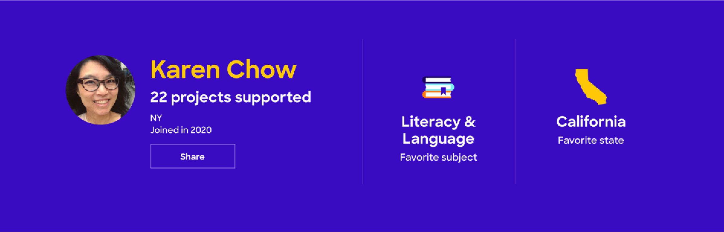
Donor profile banner with stats
The human connection
The old page, which displayed summaries of past projects supported by the donor, lacked emotional impact. Instead of showing projects, I decided to show appreciative quotations from the teachers who created those projects and include a small photo of each teacher's face. DonorsChoose requires teachers to submit a short letter of gratitude to their donors after a project is funded, so it was easy to pull that data and use it to engage the donor in a more powerful way—by reminding them that they helped a real person. Donors could navigate onward to see if those teachers had any current projects and support that teacher again.
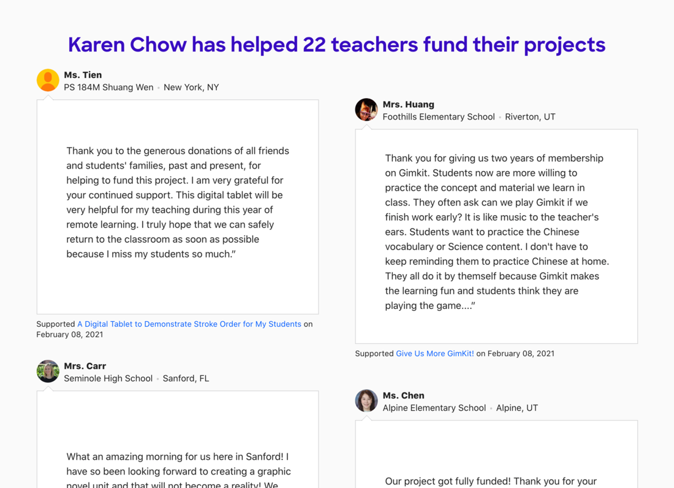
Teacher gratitude quotations
Many donors didn't upload a profile image, and the placeholder images we used for them—silhouettes of heads—lacked personality. I replaced these with five colourful abstract images from DonorsChoose's brand resources. They were applied randomly to each profile page that did not have an image provided by the donor.

Profile image placeholders
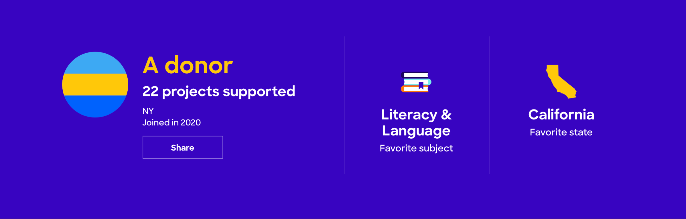
Anonymous donor profile with placeholder image
I also included social sharing functionality so that donors could share their profiles and stats with their social network.
Encouraging donors to explore more projects
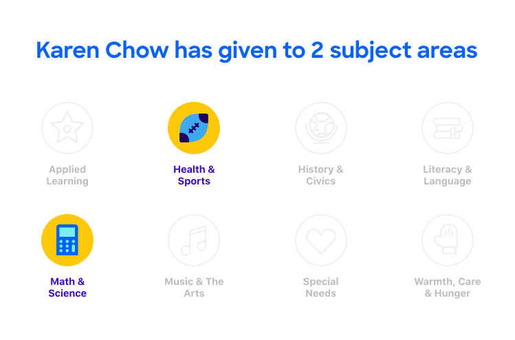
Our marketing team was interested in bringing users back to their profile, and we discussed gamifying some elements of the page. While getting return visitors wasn't one of our original goals, I considered how gamification could support our goal of encouraging the donor to give again, even if viewing their page for the first time. I decided on a simple badge system where the donor could collect badges for giving to projects in our eight subject areas. They would see at a glance which badges they had achieved (in full colour) and which they had not (in grey). Clicking on each badge would take them to the project search results for each subject.
Donor profile badges (2 collected)
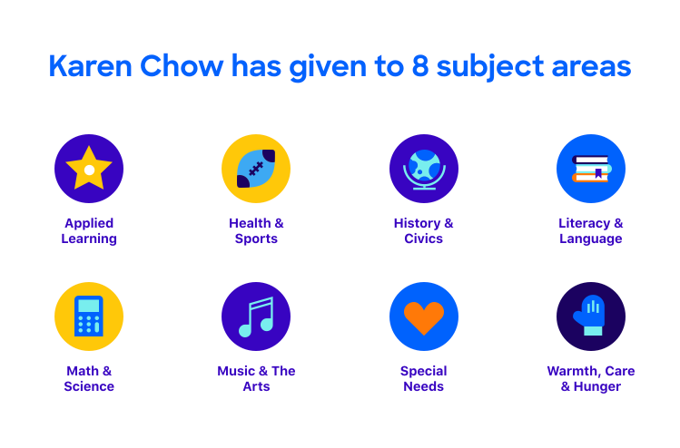
Donor profile badges (all collected)
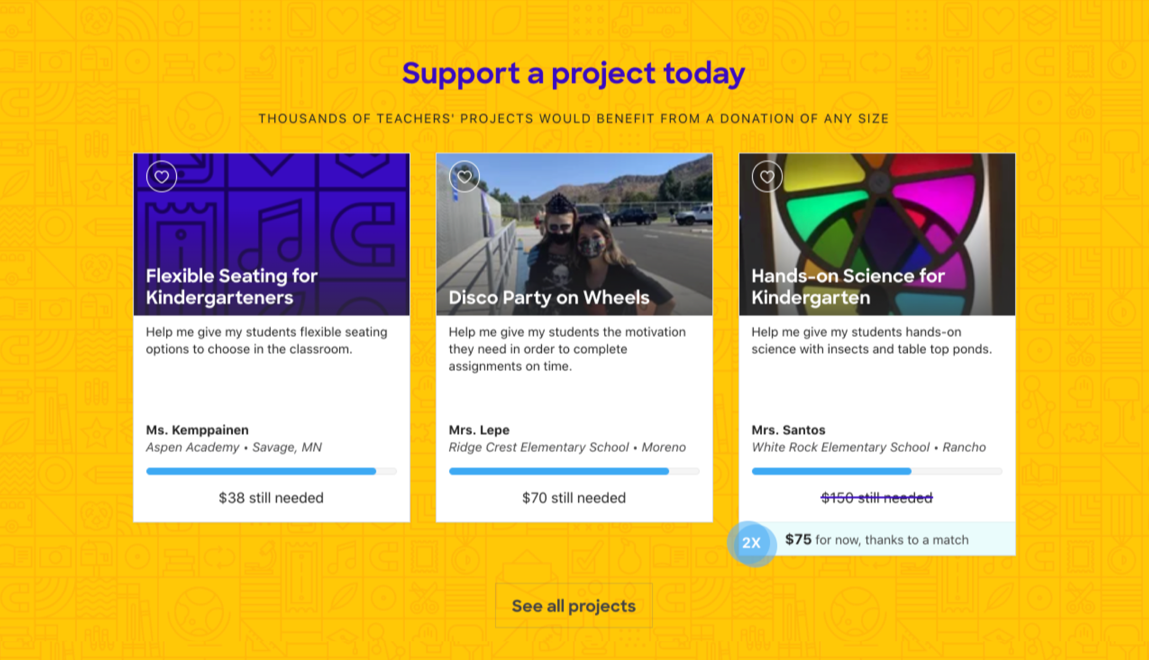
I also included three recommended projects with the title "Support a project now" based on the donor's previous activity (such as subject and location), as well as a call to action to "See more projects" that led them to a full project list.
Project recommendations
While we didn't want to use this page to aggressively push donors to give, we felt that these "soft asks" would compel them to explore more projects and find one they would support.
Outcome
We launched our 20th anniversary campaign and sent an email to every donor with a link to visit their new profile. Within 24 hours, we saw a 2000% increase in views to these pages. For the six months leading up to the launch, we had generated 1094 pageviews per week; for the next three months after the launch, we generated 1661 pageviews per week. The conversion rate from viewing a profile to making a donation also went up. Conversion averaged 13.8% for the 6 months before the launch; for the next three months, conversion rose to an average of 19%. The changes had made a difference.
Here's the design we launched:
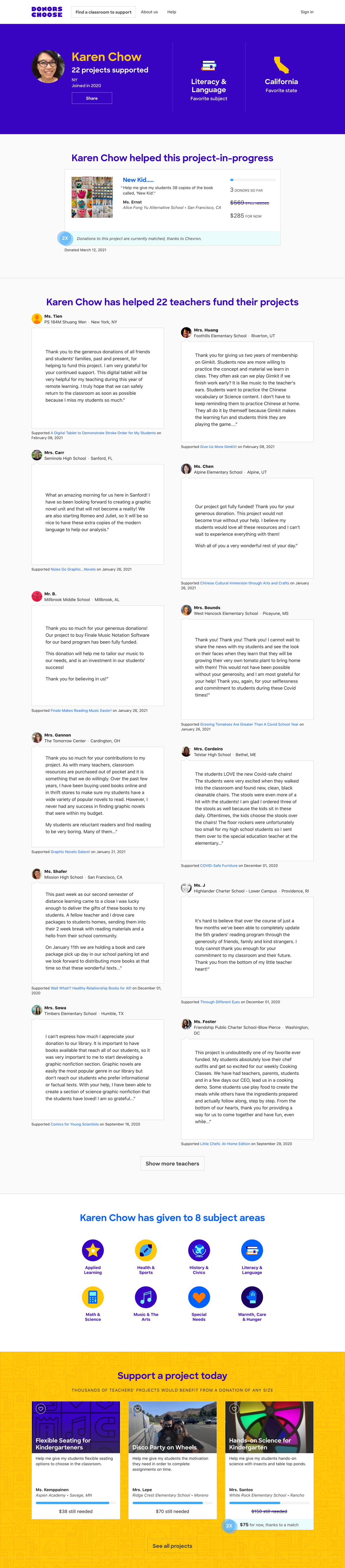
Desktop design
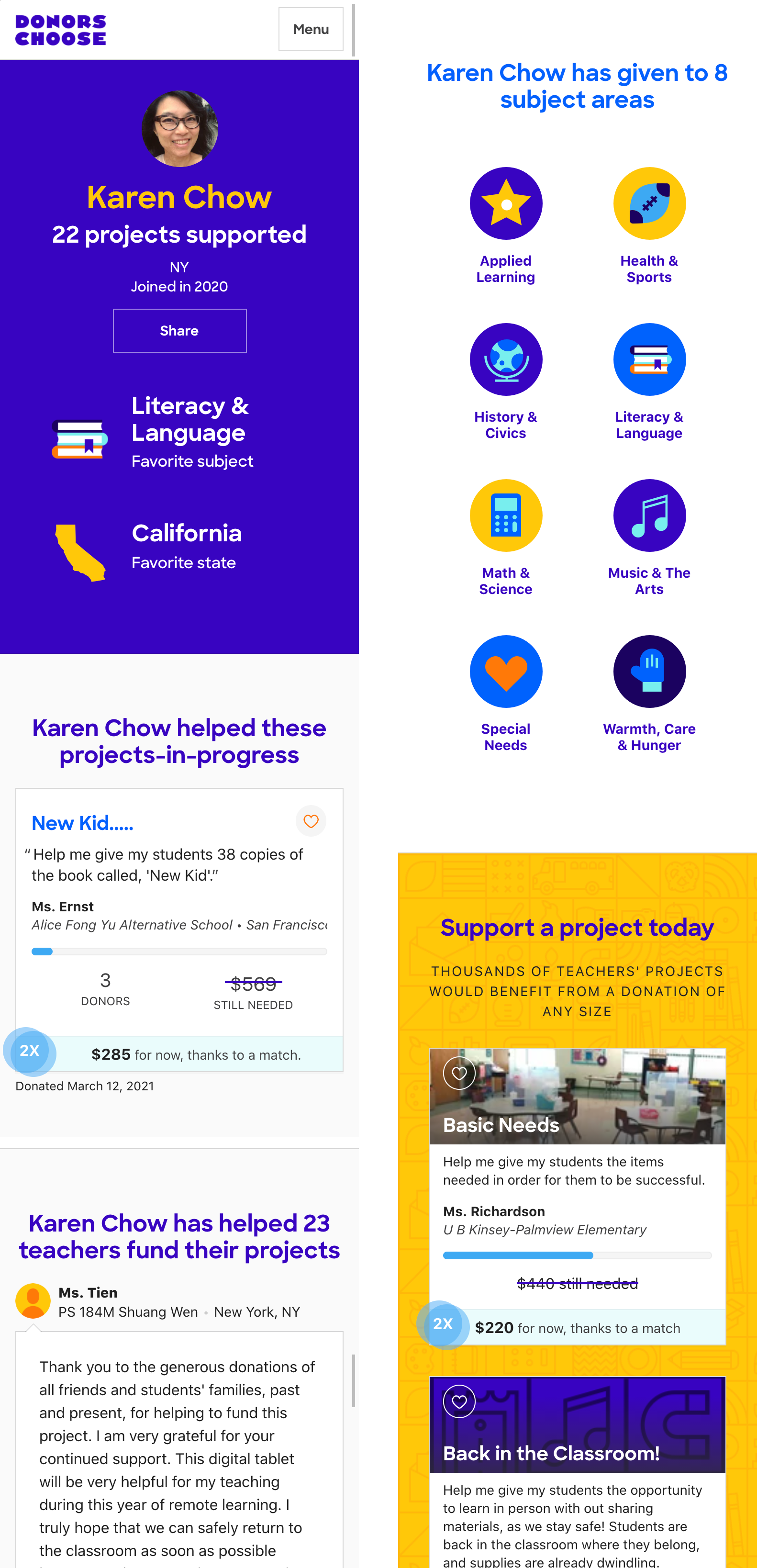
Mobile design
While we didn't want to use this page to aggressively push donors to give, we felt that these "soft asks" would compel them to explore more projects and find one they would support.
Social media engagement
Two months after the launch, we were excited to see engagement from our teachers on Facebook. These teachers were also donors. It was gratifying to see that they cared about the metrics we showed: number of projects supported, subject, and location.
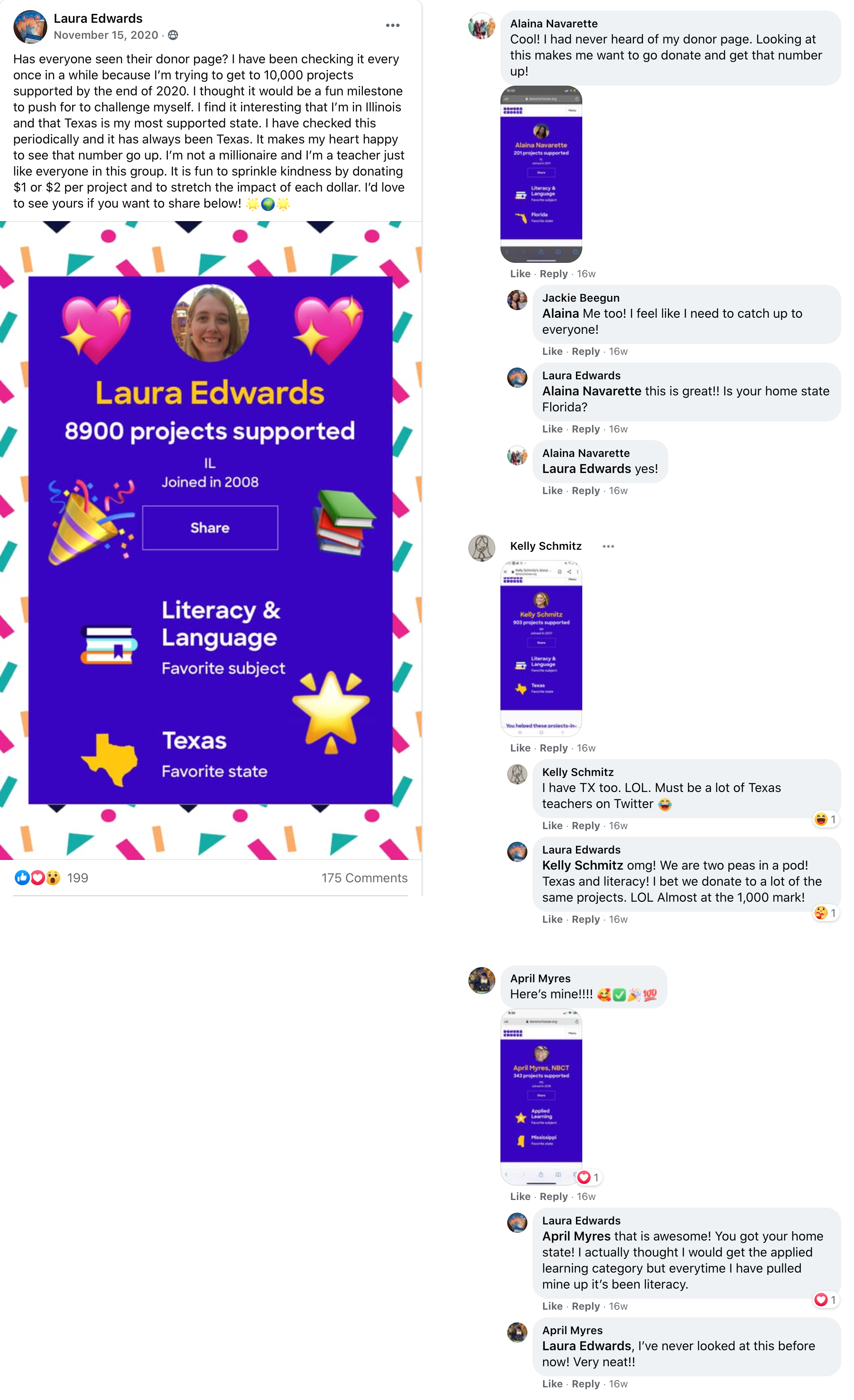
Facebook engagement
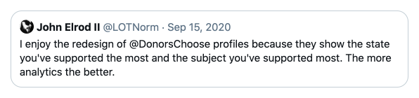
Twitter engagement
Looking ahead
We achieved our goals to make donors feel good, at least for the short term. However, six months after the launch, our pageviews are back to prelaunch levels. We'll continue to think of ways to use this page to increase donations.
See the page