
The problem
When children turn 18, US laws prohibit anyone else, including parents, from accessing their medical records and making medical decisions on their behalf. Kinfo saw a need for families to have this legal access for a longer period—for example, when kids go away to college. They wanted to start an online service that would help parents and consenting children feel in control in the case of an emergency.
Our task
Our client needed a responsive website that would simplify the process of producing four legal documents:
- HIPAA release
- Healthcare Proxy
- Living Will
- Durable Power of Attorney
Users would come to the site, choose a state, fill out the necessary information in one streamlined process, and pay a fee. The system would generate the documents specific to the user's state and send them in an email. Users would not be required to sign up or create an account.
My role
As ATTCK's UX designer, my role was to create a multistep form that would keep the user moving towards completion. I wanted to avoid redundancy; where there was information needed by more than one document, such as names and birthdays, it was important the user would only have to enter it once. Because the user was providing sensitive information, I also wanted the experience to feel robust and safe, providing explanations of legal terms and allowing the user to navigate back and forth in the form to check their inputs and edit their information.
I was also responsible for designing the payment elements, which included a cheaper tier for a single document and an upsell if the user wanted to get documents for another state. Most importantly, I had to direct users to notarize their documents after they received them—without this step, their documents would have no legal value!
Discovery
This was an MVP and the client did not have a budget for user research. It was also a new site, so there were no analytics from which I could gain insight into user patterns. After a few meetings with the stakeholders to discuss business goals, I drew inspiration from their main competitor: Legal Nature. I studied Turbotax, which I felt had a clear and painless user flow for a complicated task. I looked at graduate school applications, which usually have a multistep process.
Journey map and sitemap
Working closely with the client, I mapped out the steps of the user journey. I determined that since the parent and child needed to work together to gather the data for the form, the user should be informed of that right on the homepage. Since the site is of a legal nature, I also thought there should be no mystery about what is involved: the cost, the process, and the documents to be delivered should all be clear.
I considered problems that might occur during the transaction: For example, what would happen if a user didn't receive their document via email? Since the users would not be able to create accounts or download files from the site, they needed a clear way to contact Kinfo so that the files could be retrieved from a database and sent to them.
Then I created a sitemap to determine the flow of screens.
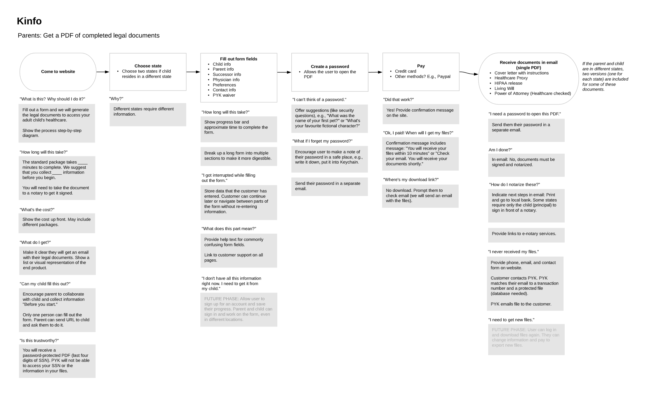
Journey map
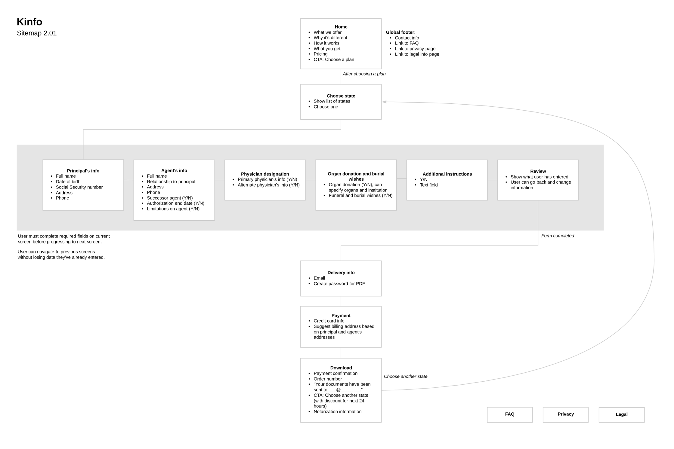
Sitemap
Wireframes and prototype
Based on my sitemap, I created wireframes and InVision prototypes for desktop and mobile.
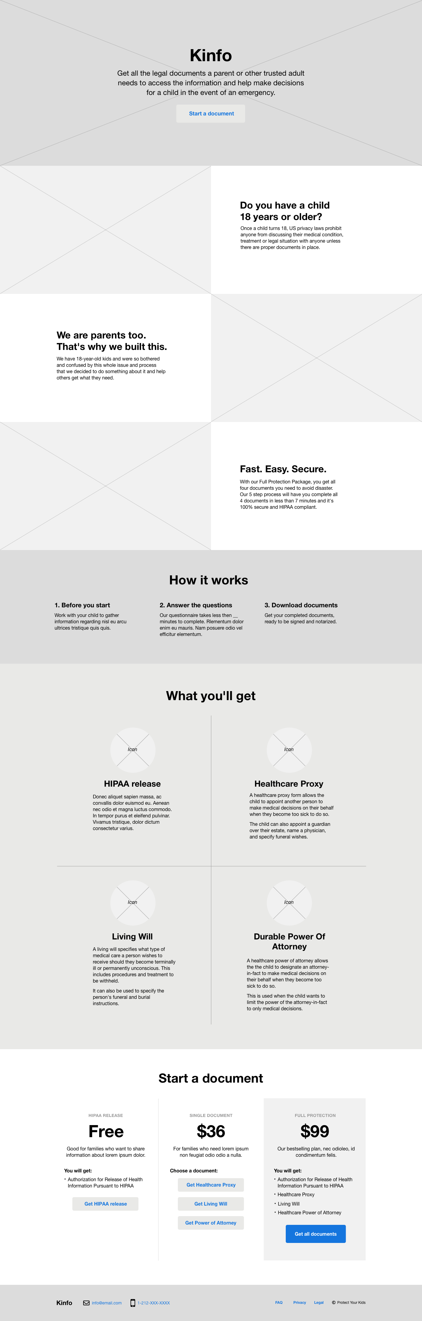
Homepage
For all platforms, I included a progression bar to keep users motivated as they completed each step. For desktop users, I added a table of contents to help them stay oriented in the flow. Users could navigate back and forth between steps in case they wanted to check their inputs or make changes. The flow was kept as short as possible, to only six screens. As the user progressed through each field, the system would display "helper text"—contextual information to help them fill out each piece of data.
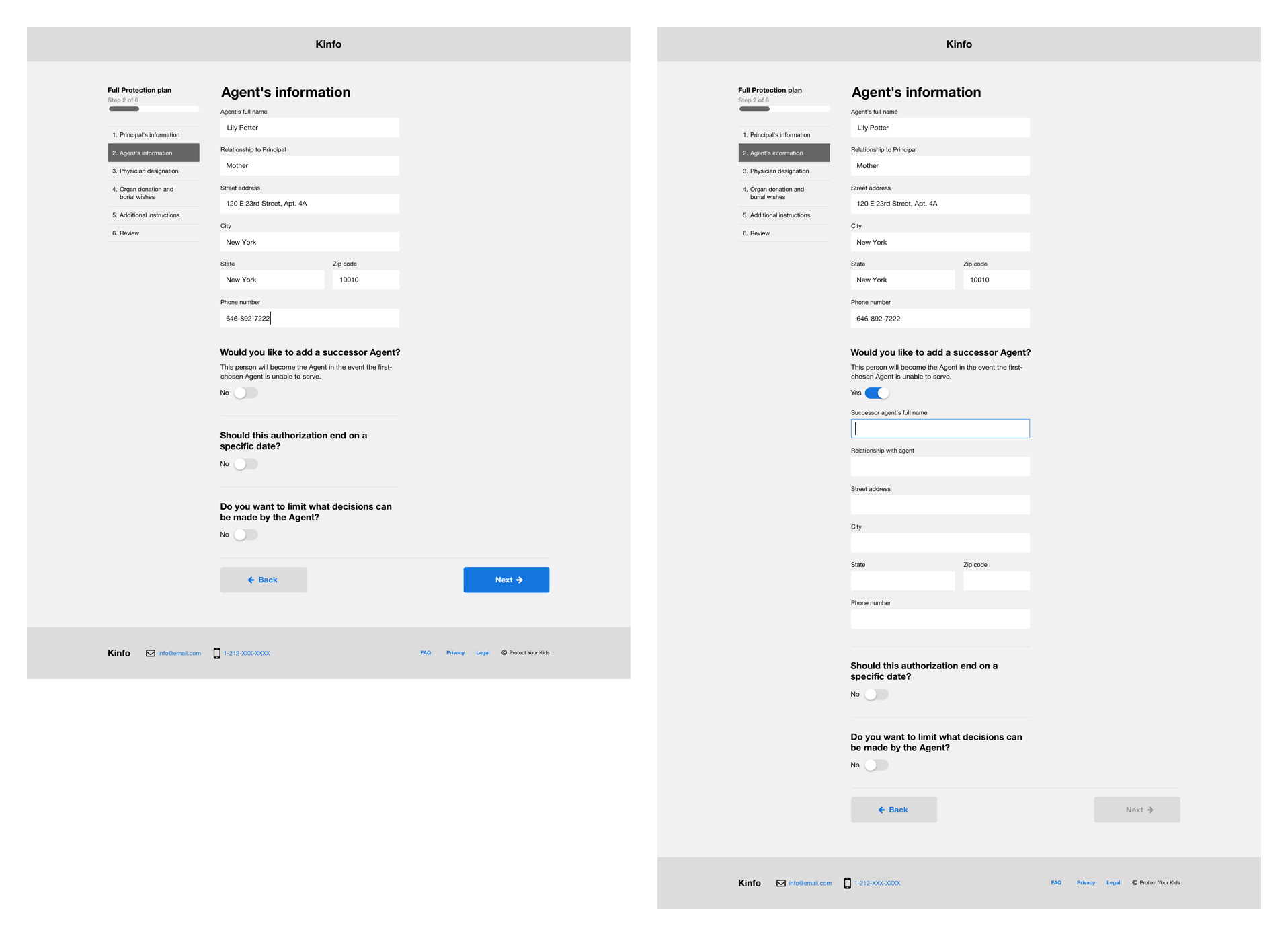
Six-step form
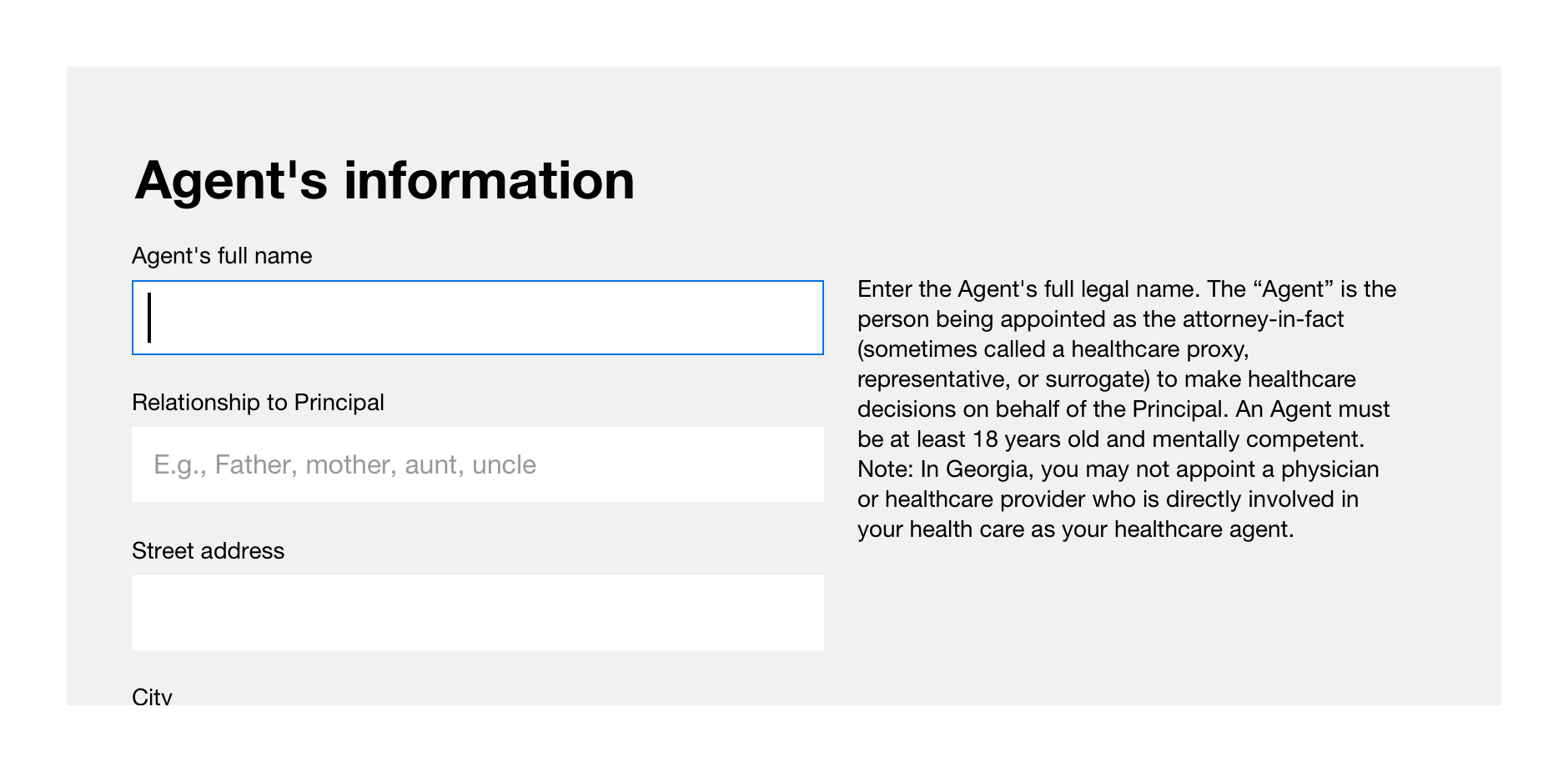
Contextual help
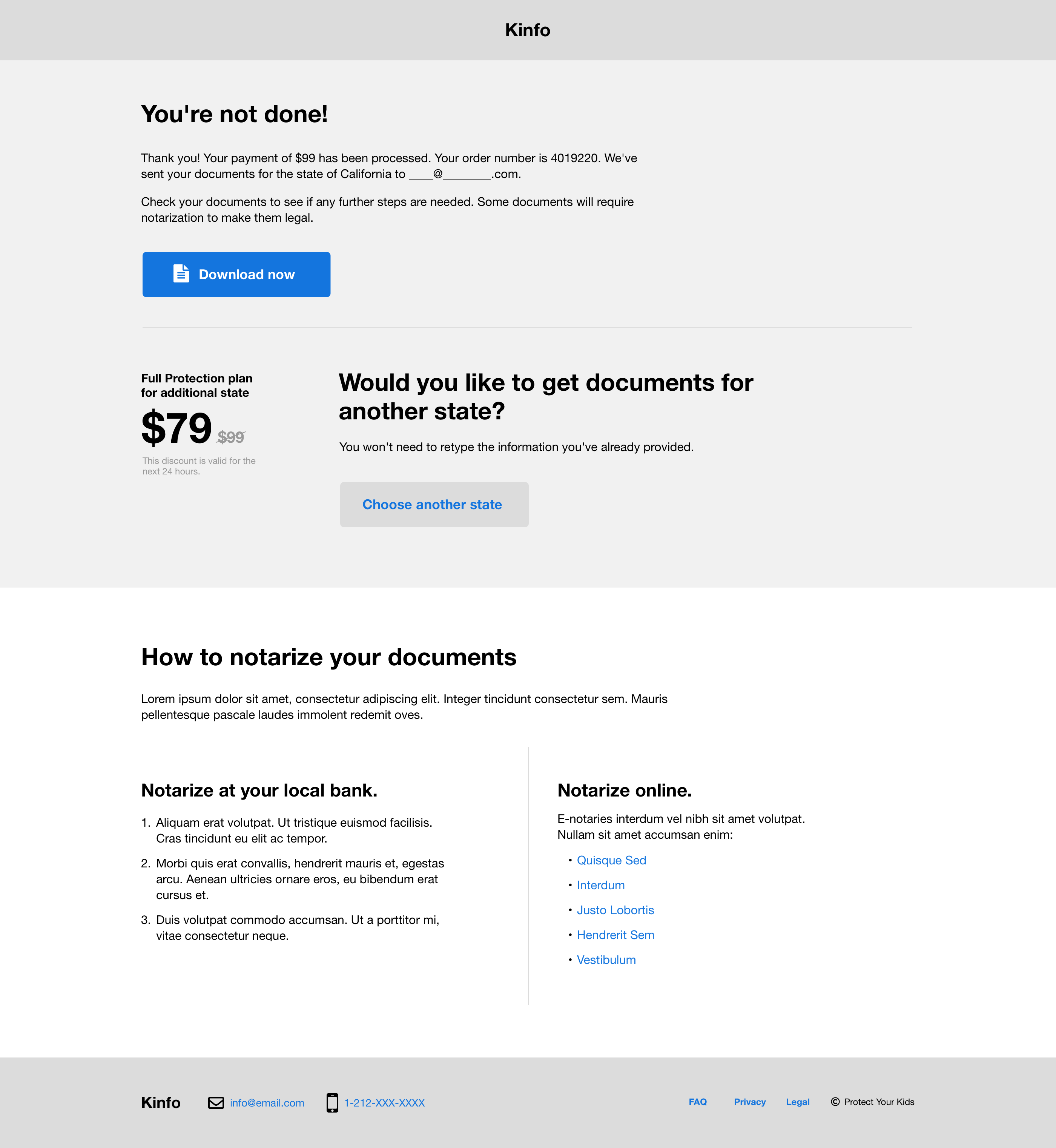
Reminder to notarize documents
One idea of mine that did not work out in client testing was the use of switches for Yes/No fields. The switches were used to trigger more form fields if the user selected "Yes." We decided that the switches did not offer an explicit enough choice to the user, and so I recommended they be changed to radio buttons in visual design.
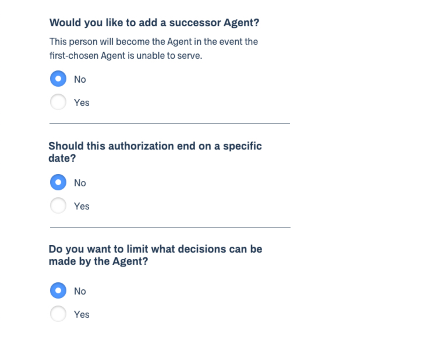
Radio buttons
Outcome
We delivered a compact, friendly solution to our clients at Kinfo. Within the first six months of the launch, the site had received 17,257 pageviews from 10,760 new users.
The founder, Paul Goldberg, gave us these kudos: "The experience of working with the team at ATTCK has been tremendous. It is incredibly refreshing to work with a team, from the top down, that is transparent, easy to work with and makes time for you. It is a lost art that more people should recognize with ATTCK. Being a startup, the collaborative environment ATTCK provides has really helped us find the right way to get out of the gate. With ATTCK you get a real partner that keeps an open discussion, in real time."
See the site