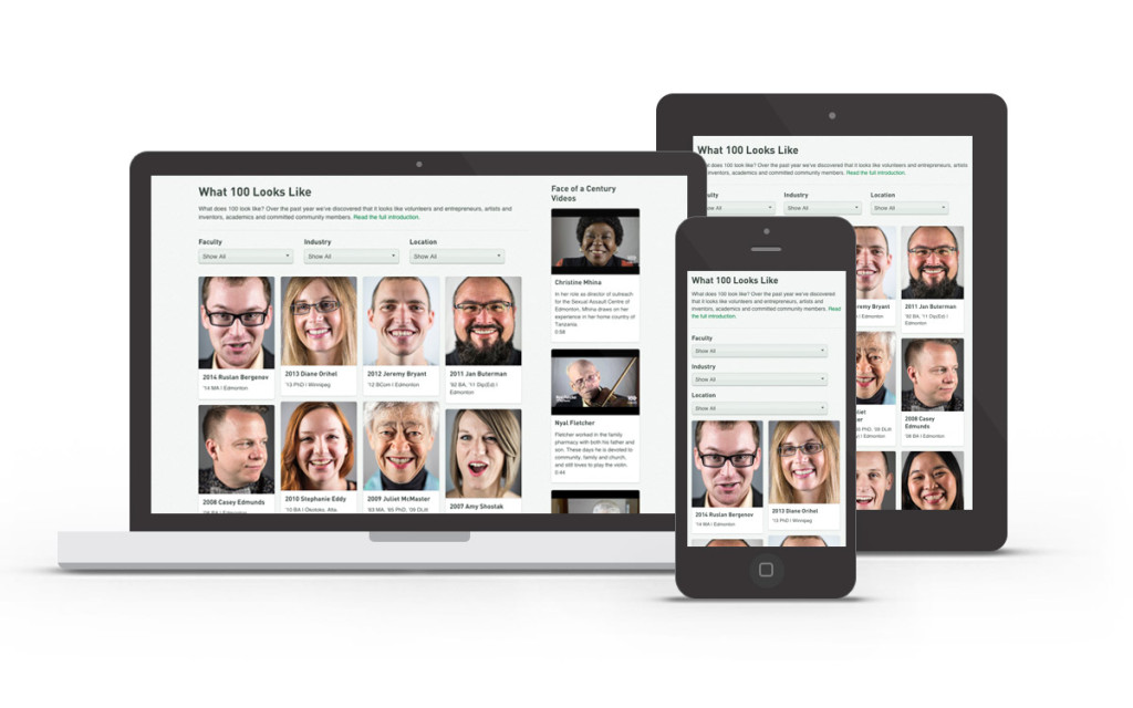
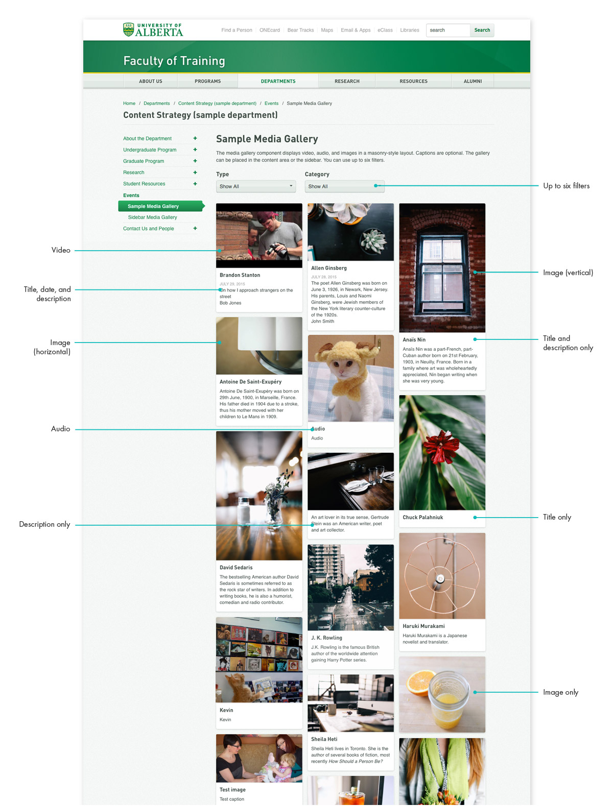
Media gallery
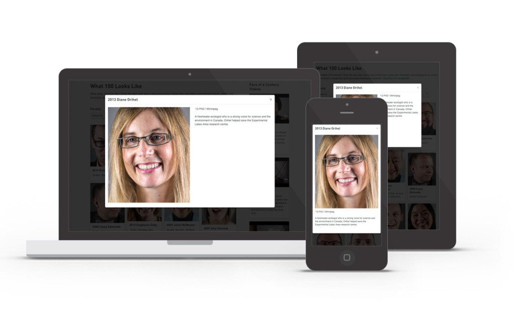
Media gallery modal
Responsive prototype
University of Alberta needed a responsive media gallery that would support video, audio, and images, along with the ability to display titles and teasers. The layout elements had to be flexible enough to serve the needs of all campus content creators.
Design and Development
University of Alberta was still using Bootstrap 2, so I incorporated elements of Bootstrap 3 to create the modal pop-ups and used masonry.js to handle the tiling behaviour.
The tiles needed to work at all browser widths and the module itself had to function correctly whether it was placed in the main content area or the sidebar. The text elements were optional, so I coded the tiles to appear correctly even if only some or none of the text was included. I made sure the modal scrolled on small screens; on large screens, I designed the modal to accommodate both vertical images (align text to the right) or horizontal images (move text below image).
I worked with a developer to implement my code with the Sitecore backend.